'CINNAMON' COLLECTION BY LIGHTLY

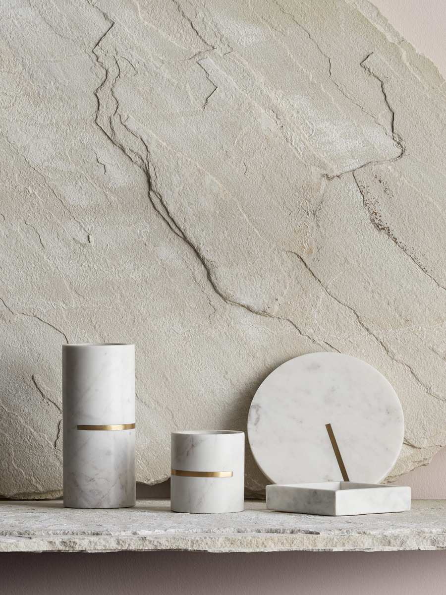
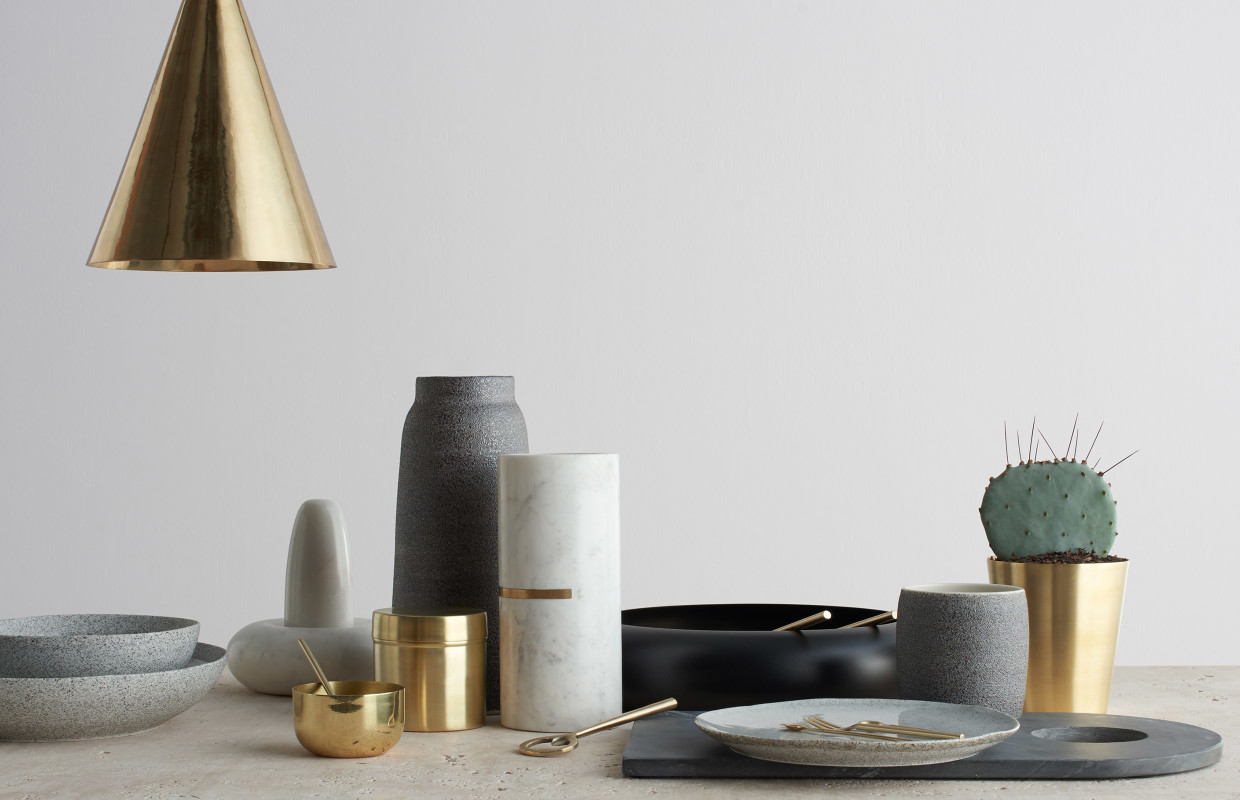
Brass. Copper. Marble. Stoneware. A combination of all my favourite materials found in one collection! I actually spent an embarrassing amount of time ogling over this spread after discovering it. I fell in love not only with the impeccable styling and the brilliant selection of colours, but the combination of materials used. This collection - 'Cinnamon' from Lightly's, an Australian design studio - is both polished and raw bringing that perfect balance of sophistication and earthiness to the table. As well, isn't this a nice little lesson on how to mix materials? The result delivers a beautifully balanced collection of elements that feels rich AND peaceful. 

Feeling like I need those brass salad servers in my life. 

Love introducing marble in small elements throughout a home. 

A speckled ceramic brings an organic touch to a table. 

Is this the colour of 'cinnamon'? I would have called it rust, but yes I guess it's cinnamon and love! 

Vessels in a variety of shapes and sizes. 

Also, why don't any of the planters I have come in pedestal form? I'll be on the hunt now. 

lightly.com.au

REKINDLE

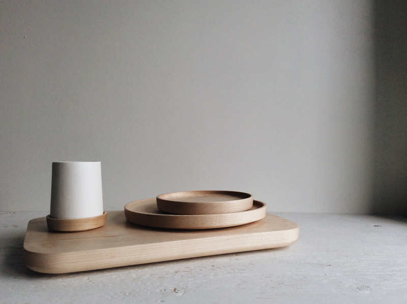
I currently have the most beautiful stack of well-crafted wood in my kitchen thanks to rekindle. I was fortunate enough to be introduced to the brand recently, and instantly fell in love with their aesthetic and the minimal design of their serving plates, platters and ceramic tumblers. 

rekindle is a Toronto based studio founded by designer Devin Schaffner who crafts quality goods made of natural materials for the home. rekindle aims to achieve a level of quality that is intended to last a lifetime and improve with age, ideally to be passed on from generation to generation as an heirloom.

Schaffner on the evolution of rekindle - "I'd been asking myself and peers questions pertaining to longevity, emotional connection, beauty, among many other things relating to the products we purchase and cherish. I distilled all of this down to the idea that if we want to counter disposability in our society, we need to be emotionally connected to the items we have in our lives."

I too am of the belief that less is more in most aspects of life and gravitate towards timeless items like rekindle's designs. It's nice to come across a brand grounded in simplicity and the conviction that surrounding ourselves with high-quality products can increase the quality of our lives and elevate the everyday.


Shown above is rekindle's - Feast Cutting Platter, the All Plate (small, medium & large) and the ceramic Arenal Cup.

To see more, visit - rekindleyourlife.ca

EPIPHYTES BY DOSSOFIORITO

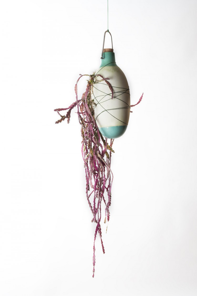
I have to admit, I had to look up the word "epiphyte" to fully understand this collection of hanging planters. So to clear it up for anyone else in the dark, "an epiphyte is a plant that grows harmlessly upon another plant (such as a tree), and derives its moisture and nutrients from the air, rain, and debris accumulating around it, instead of the structure to which it is fastened". 

Dossofiorito is a studio based in Verona, founded by designers Livia Rossi and Gianluca Giabardo, that develops projects with the aim to achieve a more comprehensive approach to the design practice. Their latest project Epiphytes, is a collection of hanging glazed ceramic vases that takes an alternative approach to the potted epiphyte houseplants, by allowing the roots to be exposed and grow around the container as they would in a forest. 

In this project Dossofioritto invites us to, "rethink the relationship with indoor nature in terms of a cohabitation more respectful and attentive to the needs of the plant. It, although domesticated, can be free to express itself in its natural bearing."

My new discovery of epiphytes seems like the perfect excuse to bring home a new plant - something I can never resist! 


VEGGIE COLLECTION BY VONTRUEBA

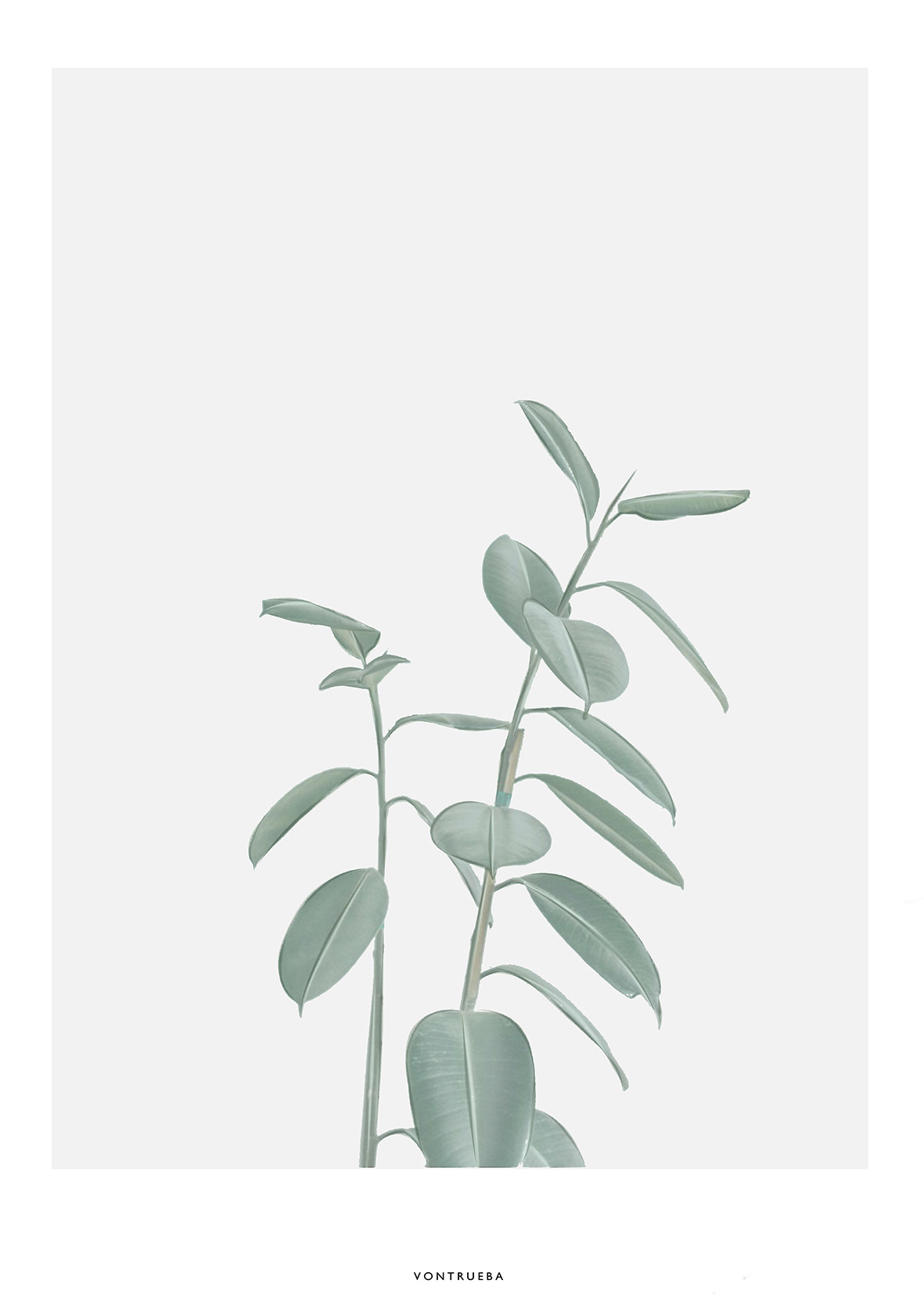
How many plants are too many? Would it be considered overboard if I covered my walls in posters of plants when my entire apartment is already full of live ones? Maybe, maybe not...

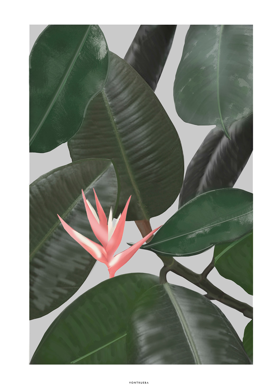
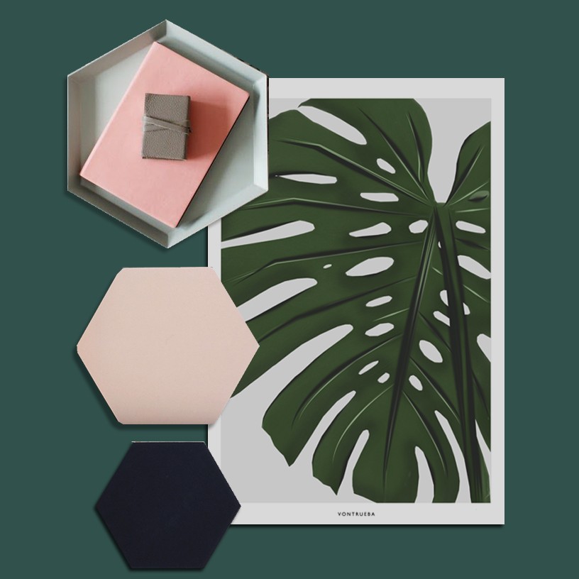
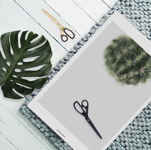
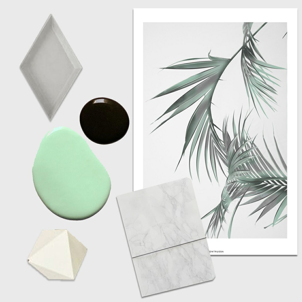
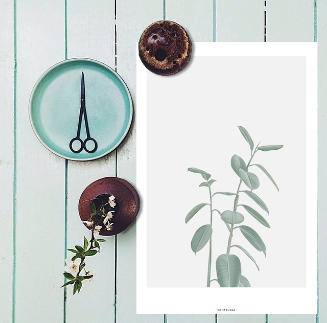
The Veggie collection by Carmen Trueba, Spanish Architect and Designer, and founder of Vontrueba Studio, was inspired by nature and botanical illustrations. Simple, bold and vibrant - these works of art allow anyone, green thumb or not, to bring a little "life" into their home.

I'm delighted these luscious prints caught my eye as they also led me to fall in love with Trueba's other collections inspired by materials, textures and geometry.

COLD PICNIC AW15

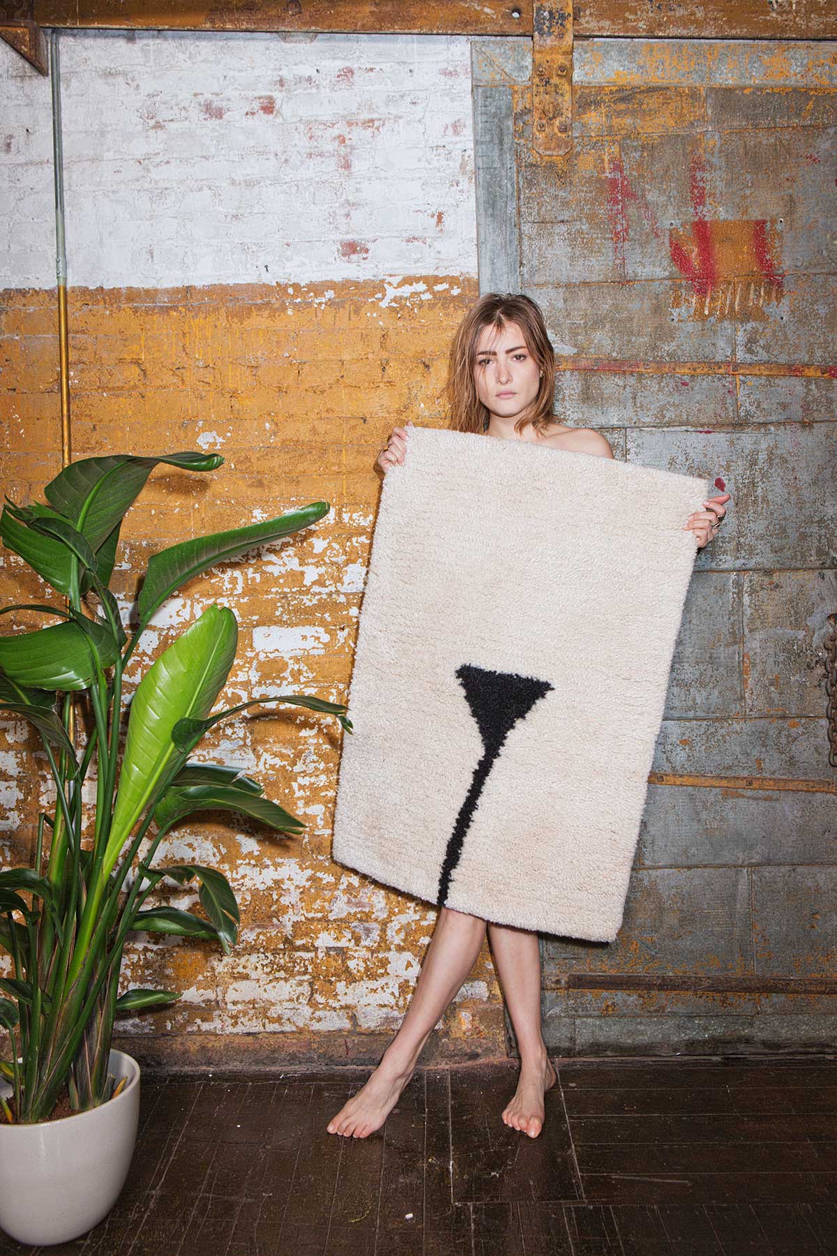
Happy Friday everyone! In the spirit of the weekend, I thought I would bring you something fun today- like boobs! Boobs are fun, right?? Well, whatever your take on that, boobs must be trending because I've seen more than a few nips popping up on prints and textiles here and there. Most recently I came across Cold Picnic's AW15 line of goods, which include a hand-tufted rugs featuring outlines of our more intimate of body parts.

Cold Picnic is a Brooklyn based studio made up of Phoebe Sung and Peter Buer, a pair of friends, roommates, and now business partners, both with backgrounds in fine arts and corporate fashion design. Sung and Buer are influenced by "indigenous crafts, the dusty yet vibrant palettes of 1970s films, and the American natural landscape". Their line of products include handmade jewelry, leather accessories, macrame home goods, and textiles.

I love how they've effortlessly combined modern with bohemian, just following their passions and not taking a stance on one side of the line or the other.  

THE TUSCIAO VALET STAND

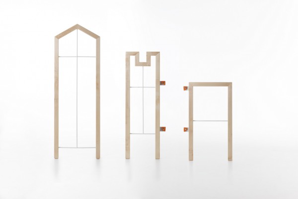
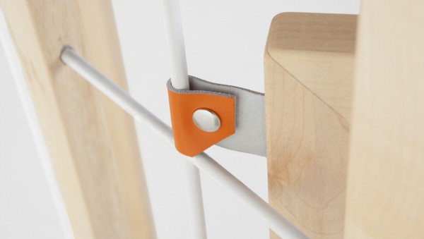
 "Tusciao" is a bedroom rack or "valet stand" made for neat and functional hanging of clothes and accessories. The geometric stand is designed by Italian designer Andrea Brugnera, who took inspiration from traditional Italian architectural landscape. 

I love the design and function of this elegant structure, and can imagine it benefiting a man with a suit jacket and tie to hang each night. I fear my personal struggle with the Tusciao would be my own neglect and it's reoccuring disappearance under a mound of laundry.  

HOCKERBANK BY JOHANNA DEHIO

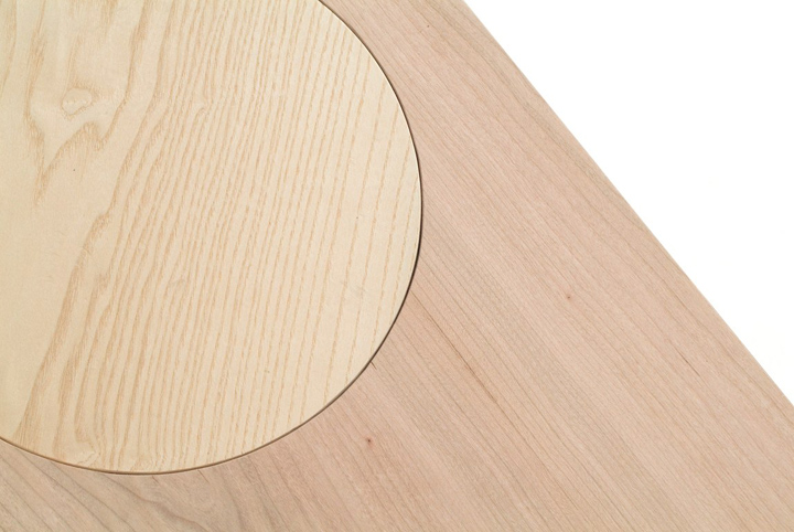
I'm always particularly drawn to an object when both function and design has been taken into consideration. Therefore it came as no surprise that I was taken by the Berlin based designer Johanna Dehio's "Hockerbank" (meaning stool-bench). Inspired by makeshift seating, this series consists of several stools that are supplemented by a plank with round cut outs and round tables which can also be transformed into a long table.

Johanna Dehio, "creates objects that are characterized on a functional level by open and accessible structures that provoke interaction. On an artistic level the inspiration through improvisation leads to a form-language that combines various materials and surfaces with a plain and clear design." 

The Hockerbank has me wanting to order a set, throw a party, and play a game of musical chairs.   

ELEVATIONS BY STUDIO ESINAM

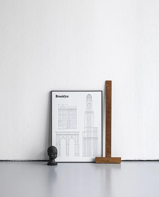
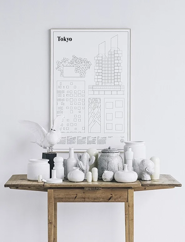
Studio Esinam is a creative studio based in Sweden, founded by an art director and architect duo who created Elevations, a series of city posters that have certainly made an impression in the world of interior design. The studio released three new prints recently- Stockholm, an addition of the Elevations series, Goteborg and Brooklyn to launch their new series Landmarks. 

"In our first print series elevations, we seek to capture the unique feeling of various cities around the world. Cities that most of us have some kind of relation to, but probably haven't seen in the format of architectural drawing. By studying the facades, directing attention to details that mostly pass unseen, we hope to touch upon qualities to the architecture that contribute to that specific feeling the city imposes on you."

Now I will just be awaiting the release of the Toronto print to either of the Elevations or Landmarks series- patiently waiting I'm sure. 

studio esinam 2.jpg
studio esinam 5 .jpg
studio esinam.jpg
studioesinam 5.jpg

URBAN SURVIVAL PACK

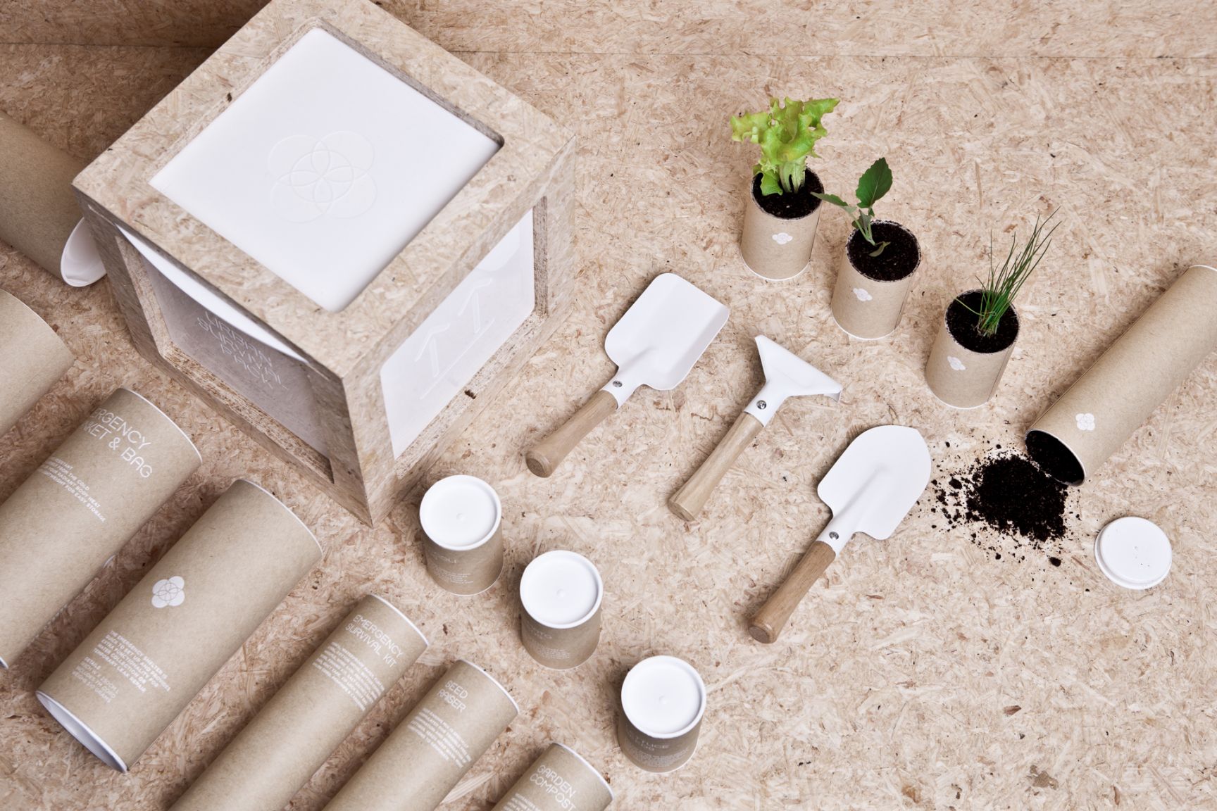
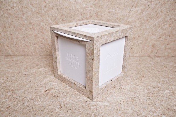
New Zealand based designer, Ryan Ramones, was given the task to create and design a possible solution to the contributing factors of urban poverty. The result came in the form of a 20cm, white, square, cube enclosing an educational kit for kids, labelled- Urban Survival Pack.  

Ramones says, “tactility and playful shapes invites the users to engage with the device whilst learning through play”. 

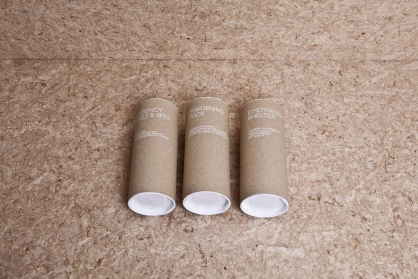
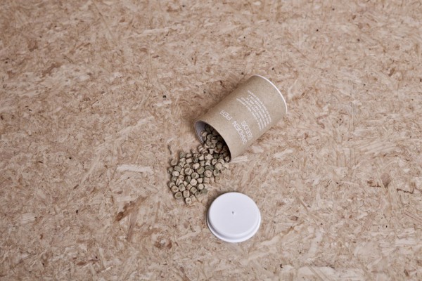
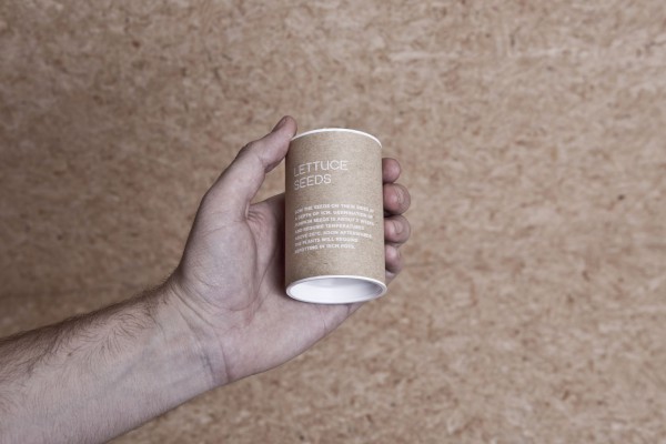
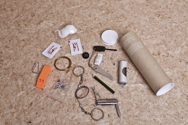
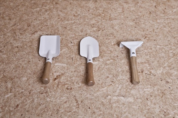
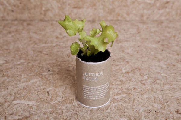
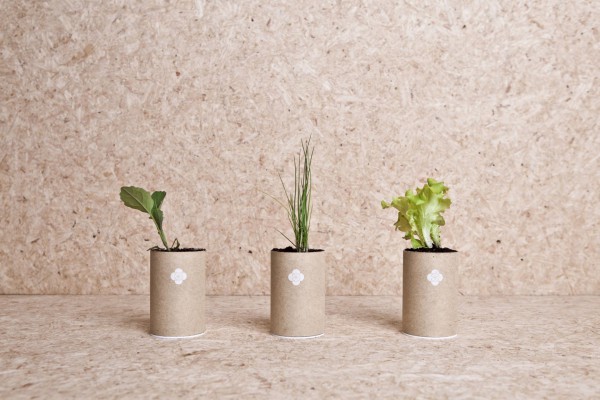
Found inside the pack are twelve cardboard tubes containing seeds, essential gardening tools, and emergency equipment. Attractive in design, innovative, environmentally friendly, functional and fun- learning has never been so beautiful. 


Found on trendland.com